


WORKS
1 / 4
2 / 4
3 / 4
4 / 4
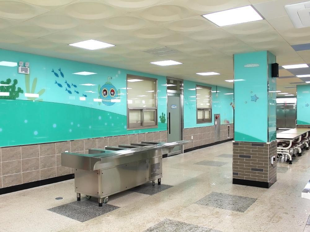
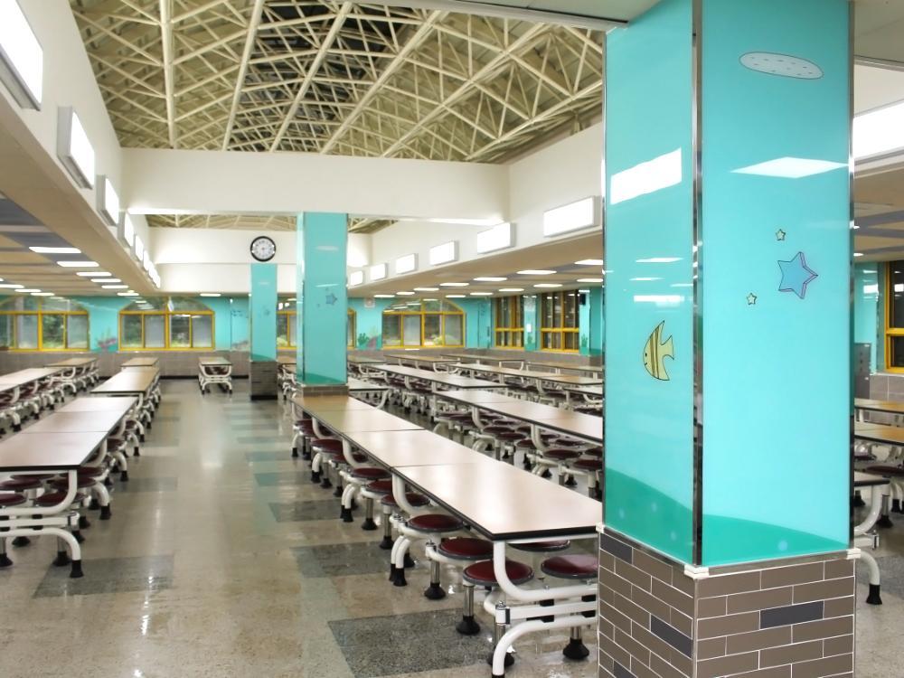
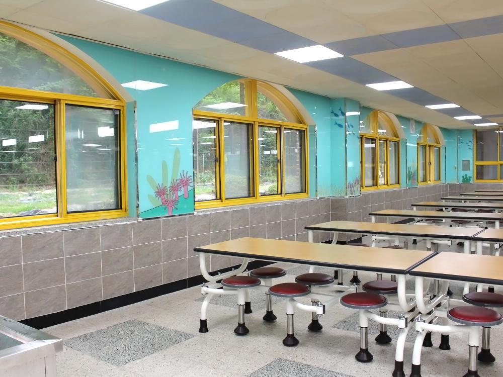
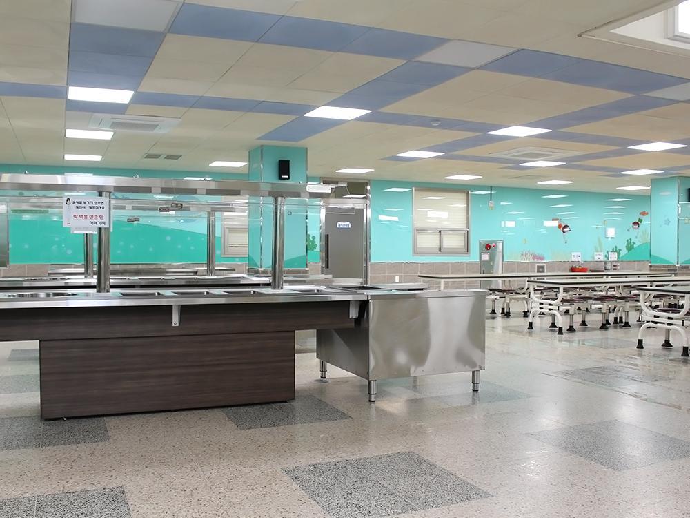
『Cafeteria』용인 대일초 급식실
![]()
『Cafeteria』용인 대일초 급식실
"바닷속을 여행 해보자!"
● 컨셉 설명
바다를 떠올리면 어떤 색상이 떠오르시나요? 대부분 파랑색을 생각하시겠지만, 학교의 식당은 스테인레스 재질의 기구와 자재가 많아 파랑색을 적용하게 되면 공간이 전체적으로 춥고 차가워 보일 수 있답니다.
민트색 계열을 적용함으로서 공간의 온도를 올려주고 바다속을 여행하듯 스토리형 이미지를 적용하여 지루해 보이지 않고 상큼한 식당 분위기로 탈바꿈 하였습니다.
"Let's Take a Dive Under the Sea!"
● Concept Description
When you think of the sea, what colors come to mind? Most would think of blue, but applying blue to the restaurant might make it appear cold and chilly due to the abundance of stainless steel fixtures and materials.
By incorporating mint green tones, the space is warmed up, and the application of storytelling imagery, akin to a journey under the sea, prevents it from looking dull, transforming it into a refreshing dining atmosphere.
● Spec. 5T 그라피코장식유리
● 적용구역 : 식당 내부 상단부 벽면 전체
● 시안 협의 시 준비사항 : 컨셉 또는 스토리 / 없는 경우 → 본글라스 카타로그 또는 홈페이지에서 2~3가지 선택
※ 그라피코(GRAPHICO)는 시공 후 실리콘 자국이 보이거나 실리콘 화학반응으로 인한 제품 하자가 반영구적으로 없는 프리미엄 제품입니다.